The Importance of a User-Friendly Website
Some articles on the internet will tell you that a user-friendly website needs to deliver as much info as possible in under 8 seconds. That is based on the common knowledge that the average attention span of an adult is 8 seconds—lower than that of a goldfish.
Except… that’s not true.
Most articles that make this claim base their statement on a report conducted by the Microsoft team in Canada in 2015. However, the article does not support this claim. It does not mention an 8-second attention span or a goldfish.
However, there is something in that paper that we should take away.
Research shows that we’re bad at focusing for a long time on tasks that we consider repetitive and boring. Endless scrolling on Facebook or Instagram and spending our time on multiple screens at the same time can also affect the attention we pay to a specific task.
So your website doesn’t need to deliver all its information in 8 seconds. A user-friendly website that converts needs to be relevant and deliver value.
What is User-Centered Design?

The definition is pretty straightforward: User-centered design involves putting the user at the center of the process. Dr. Donald Norman, a cognitive science researcher and the director of The Design Lab at the University of Carolina, pioneered the idea.
SIDENOTE. Do not confuse User-Centered Design with Human-Centered Design. While UCD focuses on the specific characteristics that define your users, HCD focuses on the broader characteristics of a person.
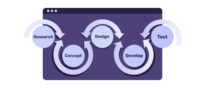
The User-Centered Design process isn’t one size fits all, but there is a general framework that people usually follow.
- Create your customer persona;
- Prototype your product based on the needs of your customers;
- Test the product and evaluate it;
- Deliver the product;
- Constantly monitor its performance and adapt it as consumer needs change;
How Website Design Impacts Organic Rankings
But why should you care about UCD when you’re building your website?
The design of a user-friendly website affects more than just the experience of your visitors. It also greatly impacts the user’s trust in your website and its organic performance in the SERP.
SIDENOTE. SERP = Search Engine Results Page.
Bounce Rate
Bounce Rate is a tricky metric. In theory, a bounce is counted whenever a user visits a single page of your website, regardless of the time he spends there.
But this isn’t very accurate.
There is no doubt that a 5-second session is a bounce. The user lands on your page, quickly analyzes it, and decides that the content does not satisfy their needs.
But if a user spends 20 minutes reading engaging content on your page, shares the article on his social media, and then leaves the website, is it still a bounce? According to Google Analytics, yes. According to anyone else? Not really.
This is why many people aren’t fans of the bounce rate metric. But there’s an alternative.
Dwell Time
This is probably one of the most important metrics that most people don’t measure. Dwell time is when a user spends on your page before returning to the SERP. So the longer the dwell time, the better.
SIDENOTE. Don’t confuse dwell time with time spent on page. While the dwell time measures the time that a person spends on your page before going back to the SERP, the time spent on page measures the time a person spends on your page before leaving that specific page. This could mean going back to the SERP, to another page on your website, or to another website altogether.
But this element is far more complex than it seems.
Although hints have been made about it, it is unclear whether this is a ranking factor for Google. Ahrefs did a great job covering everything you need to know about Dwell Time, so if you’re looking for a great resource, check out their post.
Page Speed
Page speed is a critical aspect of a user-friendly website. This metric measures how fast your page’s content loads and you can evaluate it using Google’s PageSpeed Insights.
It is well known that page speed is one of the most important ranking factors for every search engine, not only for Google. And for a good reason. People don’t want to wait around for more than 3 seconds.
In the age of speed, people expect to receive the information they need in only a few seconds.
SIDENOTE. First Site Guide has a pretty cool list of blogging resources & tools, both free and paid, that you can check out.
The History of Web Design
This year, the World Wide Web turns 30. Throughout its existence, it has changed both in terms of design and functionality.
It all started with HTML
The first websites were created using only Hypertext Markup Language. But this didn’t allow for much customization. So websites were usually very basic, filled with text and with little to no graphic images.
Check out the first HTML website for yourself.
But HTML laid the foundation for website design and helped users get used to vertical scrolling and blue underlined links.
Designers became involved as the web gained popularity as a means of communication. This is when the game changed completely.
Designers started using Graphical User Interface
GUI allowed designers to insert images and icons into websites. Then, they introduced tables and used them to arrange text and graphics. These helped website managers better organize their content using columns, rows, and other elements.
While table design might not be an ideal solution in today’s world, the page’s structure remains a critical aspect of website design. The position of elements such as the navigation bar, calls to action, and content plays a huge part in a user’s experience on your website.
In the late 1990s, a new technology entered the spotlight.
The Era of Adobe Flash
Flash allowed designers to integrate music, video, and animations into their websites and make them interactive. With it, the internet went crazy. Animations, decorations, interactive menus, and colorful buttons became the norm, and all of them tried to catch the user’s eye.
With designers joining the stage of the web, they not only shaped how it works but also how we use it by incorporating elements from our day-to-day lives into the virtual space. And the best example is the buttons. Not only were they eye-catching, but they also looked like real-life buttons. And they were screaming at users to be clicked.
But Flash didn’t have a long lifespan, either. It required users to constantly update it to the latest version, thus restricting its usability on numerous websites.
Finally, Cascading Style Sheets Came Along
CSS allowed developers to easily style every aspect of their website without coding each element individually. And soon after, website themes arrived, which allowed people to create their websites easily.
In 2010, the idea of a responsive design was proposed by Ethan Marcotte. And it was revolutionary.
This new way of using HTML and CSS allowed for a website to adapt to the device it was being accessed from. Thus, it would create the same experience for a mobile user as a desktop user. This also made maintaining and developing a user-friendly website more efficient.
With responsiveness making its way into the world, websites slowly improved. Flat design quickly became a trend, and it gained popularity over heavily decorated websites. Functionality became a priority, and visual elements took a back seat.
And this holds to this day. Visual elements are still important, but the content remains king.
If this part made you nostalgic about the good old days of the Internet, there’s a cool website called the Wayback Machine that lets you see what your favorite websites used to look like.
User-Friendly Website Trends

In 2018, Google rolled out its mobile-first indexing, as mobile internet usage surpassed desktop usage. Also, augmented reality is slowly becoming a part of our lives.
Besides the increasing use of mobile there is also:
Speed
People got used to having their information only a few taps away, and speed is a crucial part of this process. Browsers are developing new technologies that load pages faster and deliver better experiences.
In early 2018, Firefox introduced streaming compilation, making the browser 10 to 15 times faster. This helped it quickly rise in popularity, with many calling it the best browser at the moment.
Content Personalization & Context
We said it before, and I’ll keep saying it – context matters.
Users don’t have the time or patience to deal with content that is delivered poorly and out of context. They expect personalized content that addresses their needs and doesn’t make them feel like they wasted their time.
Modern Design
Flat elements are nice, but the issue with them is that they often look the same: perfect squares, circles, and triangles. But the market is slowly shifting towards bolder, asymmetric designs. And it looks amazing.
Whitespace is becoming an increasingly important factor in design. It helps the whole page look cleaner and more organized and directs the user’s attention toward the main points of interest.
Micro-interactions
Micro-interactions are the perfect element to use when you’re trying to wow your users. They not only make your website feel more alive, but they also guide users through their journey.
Each time you click the like button on Facebook or Instagram, you get a micro-interaction. But they need to have a purpose. Too many useless micro-interactions can deter users from your website and hurt your reputation.
Final Thoughts
Countless new ideas impact the digital world and how a user-friendly website should be; we only covered a small part of them. But one thing is clear, as the pandemic forced the world to fast-forward digitalization, UX Design has become more critical than ever.
Not only did the number of internet-based software increase, but the way of using and interacting with the interfaces has also changed. 2021 and 2022 forced the whole world to find tools to help continue business activity even when working from the office is prohibited.